IE9 has some really cool tech upgrades.Here are a few errant UI features that makes IE9 less than perfect. It almost gives the impression that the UI engineers did not do a stellar job. or IE9 UI is a half baked cake.
1. Address bar, and the Tab bar.
The browser defaults with tabs shown alongside a compact address bar.

For what it is worth, the tab bar can be configured to show in a separate row. but it cannot be configured to be shown above the address bar. All tab enabled browsers (Firefox, chrome, safari does it little differently) relate to the notion that address bar belongs to the tab instead of the browser itself. So they show tab bar "containing" the address bar. But IE seems to have ignored this.
2. Back button
There is useless screen area that is taken up by the weirdly large back button. and there seems to be no way to configure it to become smaller.

Firefox 4, on the other hand, makes a strong point to allow users to "use smaller icons" – to reduce screen space.

3. Notifications
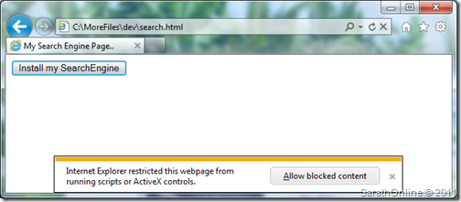
Where safari and Firefox have notification bars on the top, IE9, weirdly, positions them at the bottom with a unique coloring scheme that does not blend with windows scheme like traditional windows applications. Believe yellow is threat level?
4. Refresh and Stop button
These are mutually exclusive. In that, the status of the page can dictate only one be shown, while the other could be hidden. This could have saved screen space, may be not too much, but why have two ambiguous action buttons shown at the same time? FF – finally – merged the stop and refresh button to save screen real estate. IE9 still shows both.

5. The Star.
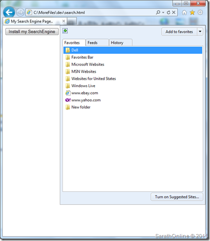
Stars recently have made an unofficial standard to one click bookmark/favorite (thanks to Google). IE9 seems to be defiant of the fact and instead shows a floating favorites bar on the left when you click on it. and then you could add to favorites. So to favorite a site, you need two precious clicks.
6. Favorites floats on left, docks on right
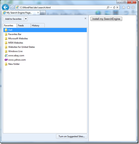
The afore mentioned aberration, gets even weird, the left-floating favorite bar flies to the right when you "dock it"
7. The title bar is useless!
IE9 made the title bar completely useless. A empty strip of transparent background with NOTHING in it but the 3 window control buttons on the right end, is a stunning difference from other 2011 products from Microsoft. For example office 2011 apps have a save, back and forward, an formatting menu's right on the title bar. and if FF4 can manage to get tabs on the title bar (image above), why can't IE9?

1. Address bar, and the Tab bar.
The browser defaults with tabs shown alongside a compact address bar.

For what it is worth, the tab bar can be configured to show in a separate row. but it cannot be configured to be shown above the address bar. All tab enabled browsers (Firefox, chrome, safari does it little differently) relate to the notion that address bar belongs to the tab instead of the browser itself. So they show tab bar "containing" the address bar. But IE seems to have ignored this.
2. Back button
There is useless screen area that is taken up by the weirdly large back button. and there seems to be no way to configure it to become smaller.

Firefox 4, on the other hand, makes a strong point to allow users to "use smaller icons" – to reduce screen space.

3. Notifications
Where safari and Firefox have notification bars on the top, IE9, weirdly, positions them at the bottom with a unique coloring scheme that does not blend with windows scheme like traditional windows applications. Believe yellow is threat level?

4. Refresh and Stop button
These are mutually exclusive. In that, the status of the page can dictate only one be shown, while the other could be hidden. This could have saved screen space, may be not too much, but why have two ambiguous action buttons shown at the same time? FF – finally – merged the stop and refresh button to save screen real estate. IE9 still shows both.

5. The Star.
Stars recently have made an unofficial standard to one click bookmark/favorite (thanks to Google). IE9 seems to be defiant of the fact and instead shows a floating favorites bar on the left when you click on it. and then you could add to favorites. So to favorite a site, you need two precious clicks.

6. Favorites floats on left, docks on right
The afore mentioned aberration, gets even weird, the left-floating favorite bar flies to the right when you "dock it"

7. The title bar is useless!
IE9 made the title bar completely useless. A empty strip of transparent background with NOTHING in it but the 3 window control buttons on the right end, is a stunning difference from other 2011 products from Microsoft. For example office 2011 apps have a save, back and forward, an formatting menu's right on the title bar. and if FF4 can manage to get tabs on the title bar (image above), why can't IE9?
